Oh, Milano!
City branding, Milan, Typography
The City of Milano has a corporate design based on the red cross of St Ambrose. It is a heraldic shield design combined with the Name of the City. There are different versions of the logo but it is not clear which logo is used when and why.
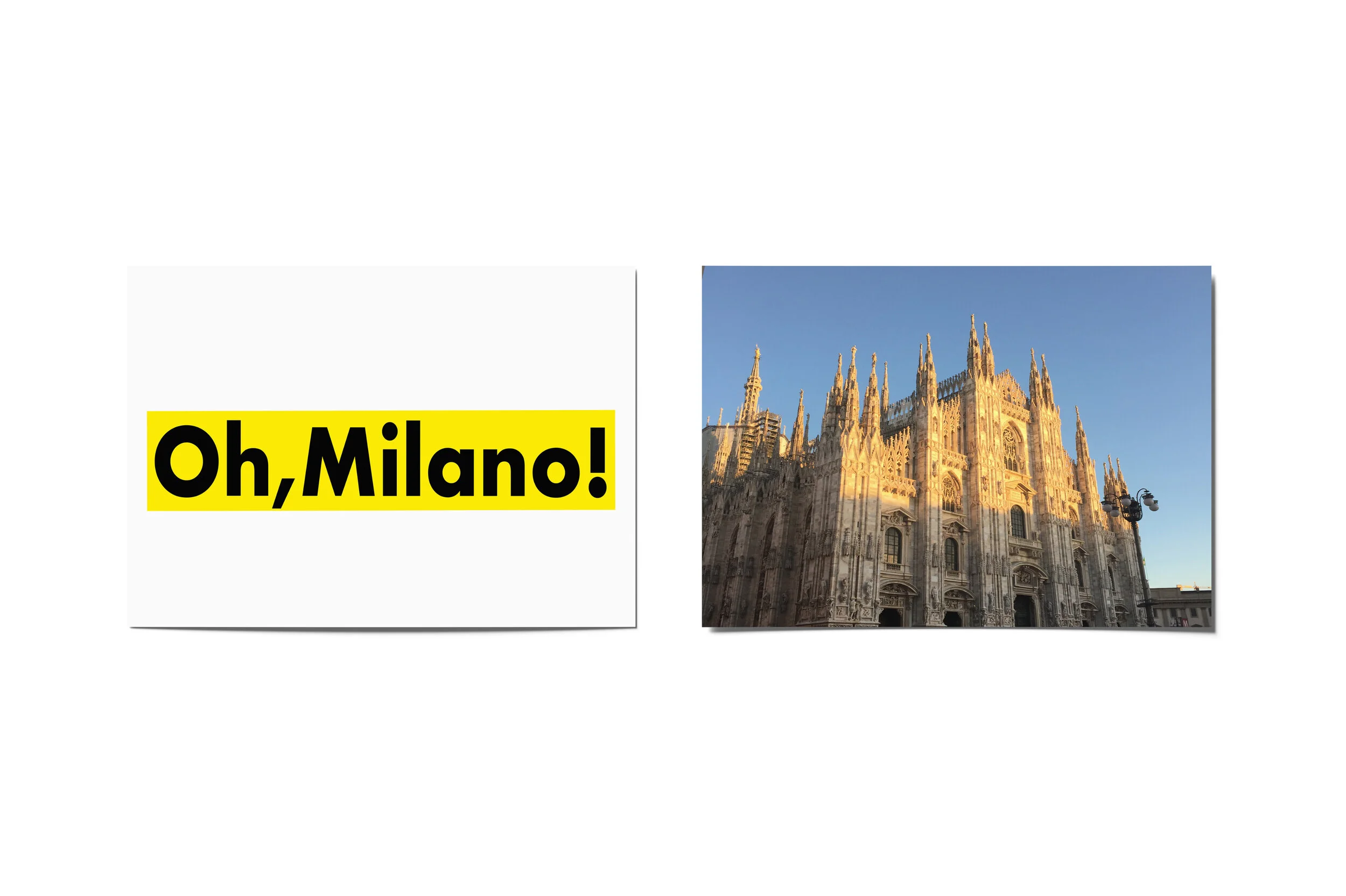
In this campaign, you will see how an expression turns out to be an identity for the city to attract people from different parts of the world and those expressions are always playful and colorful.
Client: Pentagram Berlin
Year: 2018


